Get to know the new and simplified content layout
This program of improvements is currently in Beta and subject to change. Learn more about:
The new, simplified content layout has reorganized and streamlined some key workflow actions and tools to make creating, collaborating, and viewing content in Confluence more predictable and efficient. With these beta improvements, headers, sidebars, and panels are now consistent across all features.
What to expect:
Consistently placed headers, menus, and toolbars across all of Confluence.
A new floating action bar that includes a Details panel for pages and live docs.
More actions in the top right
...menuChoose how your toolbar appears
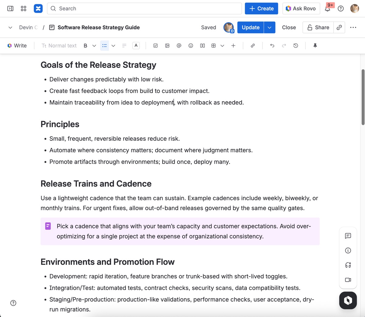
Header: Breadcrumbs
The navigation path of your content, also referred to as the breadcrumbs, will now be tucked away while you’re working at the top left of your screen. By selecting the down carat (), you can now view the entire path whenever needed.
When the left sidebar is expanded, breadcrumbs will appear progressively, as you add content to whatever you’re working on. However, it should always be viewable when the sidebar is collapsed.
Header: Last updated
The timestamp showing when your content was last updated now lives in the header. By hovering or focusing on the date, you’ll see more details—like who made the last update.
If the last update was made in a previous year, the year will be shown alongside the date to give you more context at a glance.
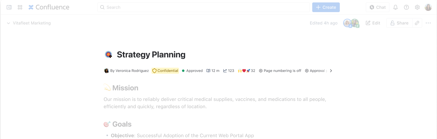
Title area
Information under the title of your content will now appear progressively, as it becomes available and relevant. Here’s what you can now find and interact with in the area below a page or live doc’s title:
Content owner
Content classification
Content status
Emoji reactions
Read time (once content is added)
Views (once content has been viewed)
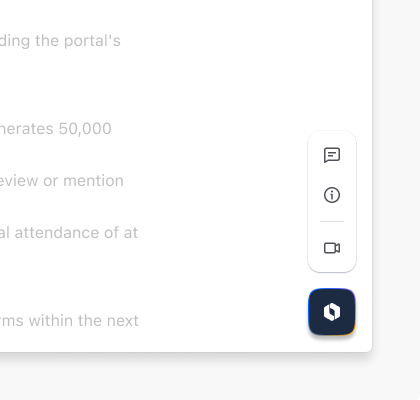
The floating action bar
To help you find and access your most important tools with greater ease, a floating bar of action buttons is now available. It will remain at the bottom right of your screen as you create, collaborate on, and view live docs and pages. Here’s what you can do from the floating action bar:
Open a panel view of all comments - unread, open, and resolved - on a live doc or page
Open a Details panel that includes your content’s most relevant metadata
Add an emoji reaction
Create a Loom video
Enhance your workflow with Atlassian Intelligence (Premium and Enterprise only)
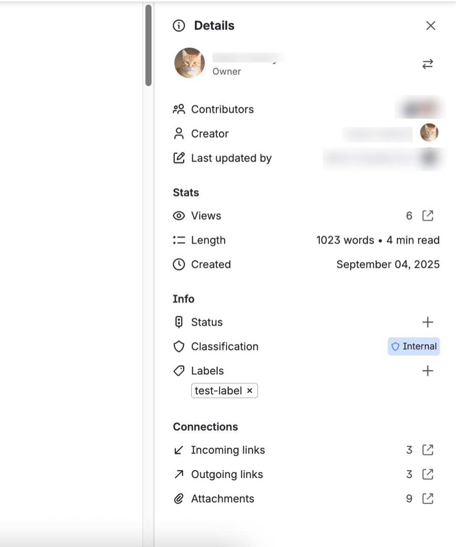
The Details panel
Displayed on the right side of your screen, the Details panel allows you to view and manage key aspects and information related to your content. Here’s what you can do from this panel:
View and change content ownership
See how many views your content has gotten, and access Analytics
View content length and read time
View all contributors
View creator name, avatar, and created date
View and change content status
View and change content classification
View and add labels
View and interact with any included files, attachments, Jira links, or Smart Links
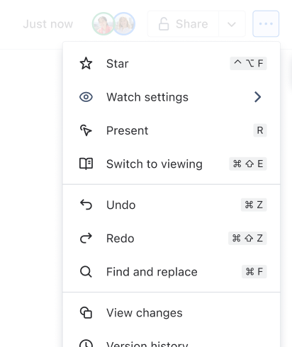
The More actions () menu
Now that various items have been relocated from the header and into the Details panel, the updated More actions () menu now includes:
Star
Watch settings
View changes
Undo
Redo
Find and replace
Version history (view changes)
Automations
Apps
Copy
Move
Templates and import
Convert to live doc or page
Export
Archive and delete
Note: With the new content layout enabled, Marketplace app buttons in the header of pages and live docs will not be supported. Impacted apps are in the process of being supported in other locations. To learn more, visit this status page.
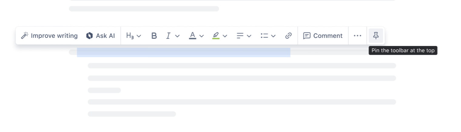
Select where your toolbar appears
When you select ... from the toolbar menu, you can choose where you would like your toolbar to appear:
Fixed at the top, or
In-line when you select text
How to use the new toolbar and insert elements
Fixed at top toolbar
Fixed at the top is how the toolbar has traditionally appeared in Confluence. When you fix your toolbar at the top, more elements such as media, tables, and emojis will appear. You can also undo, redo, and view changes.
In-line toolbar
For a more minimalist feel you can let it appear in-line when you select text. The in-line toolbar lets the formatting tools come to you, rather than having to scroll or move to the top of the page.
To select text:
Drag your cursor over words
Select the drag and drop handle. This will highlight text within a content block.
Use keyboard shortcuts:
Mac
Command + Shift + Left/Right arrowWindows
Ctrl + Shift + Left/Right arrow
Was this helpful?